Websites
LightArt Website
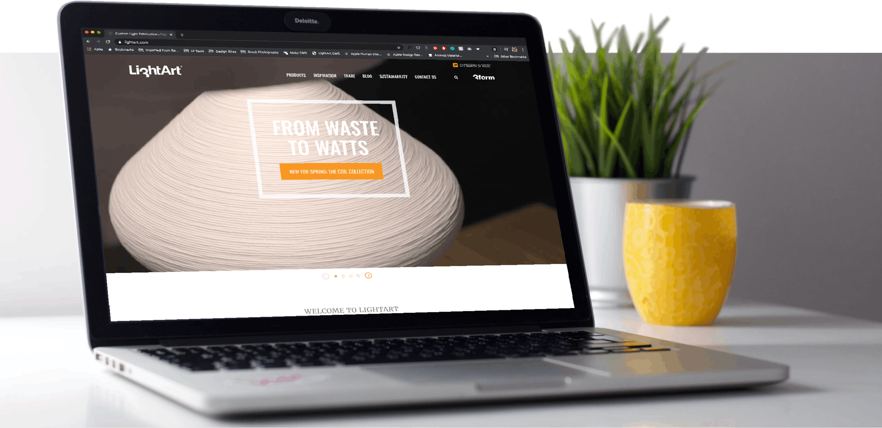
LightArt and Moby have partnered for many years on the expansion of their digital marketing materials, and for the new version of an online catalog they set their goals higher than ever. The site needed to embody their hand-crafted, custom, and technically cutting edge core values. While still being visually impressive and engaging to several contrasting audiences who have very different needs from the site. As well as allowing for a new level of storytelling for their expansive product line while still being easy to expand and manage for the LightArt team.
Solution
Enabling storytelling
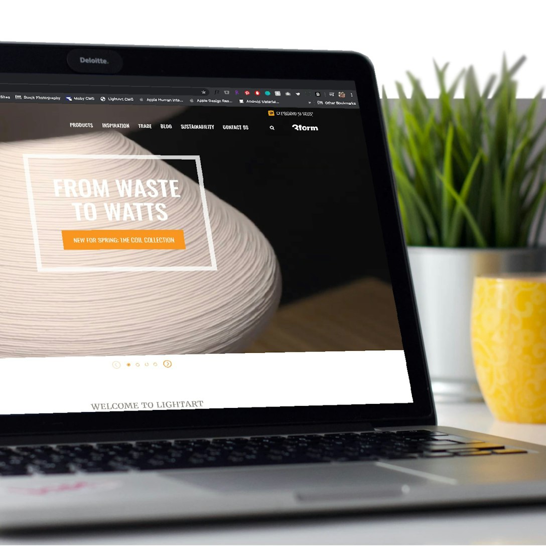
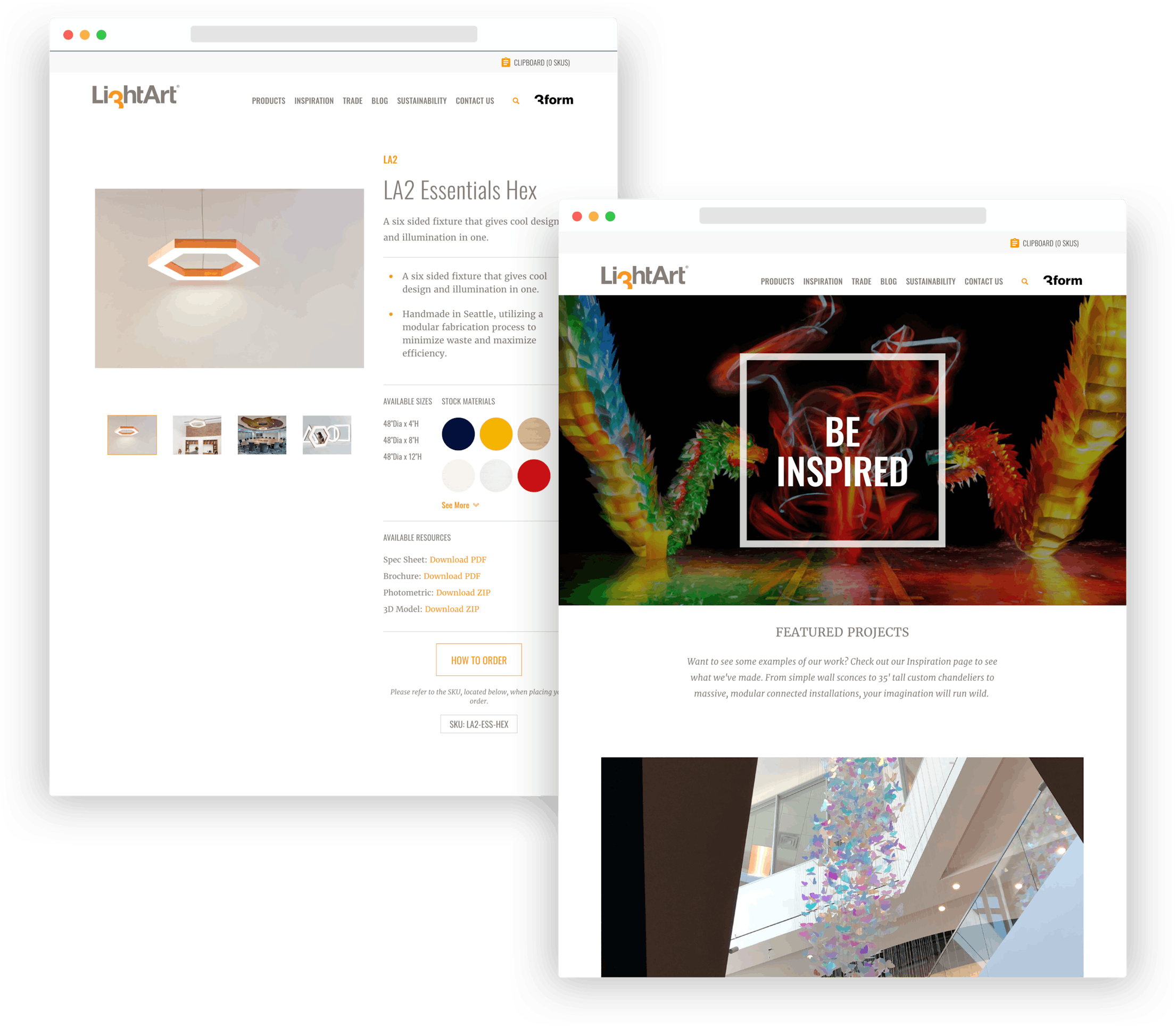
Throughout the design process we focused on creating a website that could showcase the unique backstories of their products visually and interactively. LightArt designs beautiful print catalogs for distribution to interior designers, architects, and partners and we wanted to embody that branding in a site that also felt modern for the web. To do so we focused on bold typography, edge-to-edge imagery, inspiration galleries, and even a product configuration tool.
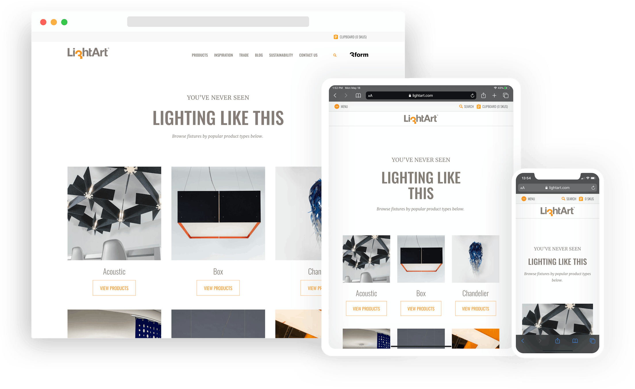
We designed the site to be as easily accessed by a consumer or individual who may be shopping for something for their home or office, as well as trade professionals. Key content for each group is prominently featured in the site's information architecture, and guides each group to the appropriate content organically.
Additionally the site was designed and developed to work just as well on a mobile device as larger screens. A truly cutting-edge responsive website / progressive web app.
Craft Content Management System
We chose to use Craft CMS for the backbone of the site as it is a very popular, robust, easy to use, and be designed for a custom user experience for our clients. Plus, it's a CMS that the Moby team has used for many sites such as Sound United's Polk and Definitive Technology ecommerce platforms, as well as this site!
One of the key challenges with creating a site that can be infinitely adjustable is using what we call a Content Block based templating system rather than a group of page templates. Using Craft we created a toolbox of content blocks that can be stacked on top of one another like lego bricks. Content Editors don't choose from inflexible templates, but rather build up each page uniquely. Leading to flexibility and creative control for the content creation team.
IMPACT
Lighting the way
Immediately on launch the site got wide-spread praise and appreciation from both LightArt's partners and customers. The trade professionals that use the site daily love the additional resources, inspiration gallery, video catalog, and talking points provided by the site content. For all audiences the site has a much lower bounce rate, increased content engagement, and increased social sharing.


